- Story
Communicating the patient journey visually
11.08.2025 The design prototype by Michaël Laurac and Jimmy Schmid shows how patient data visualisation can simplify communication between health professionals and patients and make decisions easier.
Key points at a glance
- Health data is complex and often difficult for patients to understand.
- Two BFH experts have analysed, abstracted and visualised patient data.
- The visual representation facilitates communication between the patients and healthcare professionals.
- It helps patients make decisions about their health.
What is the ‘Health Chart’ project?
The ‘Health Chart’ project analyses patients’ health information, abstracts it and presents their state of health as a map. The Health Chart can be used for communication between patients and healthcare professionals. Patients are to use the tool as a decision-making aid.

The Health Chart can be used to facilitate communication between patients and healthcare professionals.
What are the benefits of visualising health data?
The Health Chart can be used to facilitate communication between patients and healthcare professionals, as both parties can see directly what they are talking about. It makes it easier for non-experts to understand their personal health situation, view options and make decisions.
How was the Health Chart developed?
First, the researchers conducted a literature review. This confirmed that a digital visual representation of the patient journey can indeed be a valuable tool for patients and support them in making decisions.
A team identified and organised the health data needed in the patient journey. This encompasses symptoms, examinations, diagnoses, therapies and monitoring of results. The design team then transformed these abstracted data types into a visual representation, ensuring that it did not lose any nuance or overwhelm the users.
How does such a visual patient journey work?
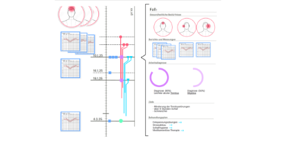
The entire process is displayed chronologically along a vertical axis. Symptoms, working diagnoses, examinations and treatments are placed visually on the timeline. A carefully developed colour coding and shape system increases clarity:
symptoms are red, treatments are light blue; objective examinations are square, patients’ descriptions of symptoms are round, and so forth.
What are the next steps of the project?
With the help of funding from BFH’s Humane Digital Transformation strategic thematic field, the team has developed a presentation concept. It is a starting point and is intended to stimulate discussions and facilitate workshops and future development phases. In the next step, the design hypotheses are to be tested with patients and professionals, using realistic patient data, in order to further improve the model. Additional funding must be secured for this.
More about the project and the BFH experts behind it
M.Sc. Michaël Laurac is a tenure-track lecturer at the Institute for Medical Informatics at Bern University of Applied Sciences. He teaches mobile health and billing systems and supervises student projects on the design and implementation of IT solutions in the healthcare sector. In applied research, he focusses on the patient journey, shared decision making and the analysis and design of healthcare applications.
Prof. Jimmy Schmid is a communication designer and is part of the management team of the Institute of Design Research at Bern University of the Arts (HKB). He coordinates the two research fields of Environmental Communication Design and Knowledge Visualisation. Head of the MAS Signaletik degree programme, he is also a guest lecturer and expert at various national and international universities, colleges and institutions. In the field of signage, he works as an author, on study commissions and as a consultant.

